|
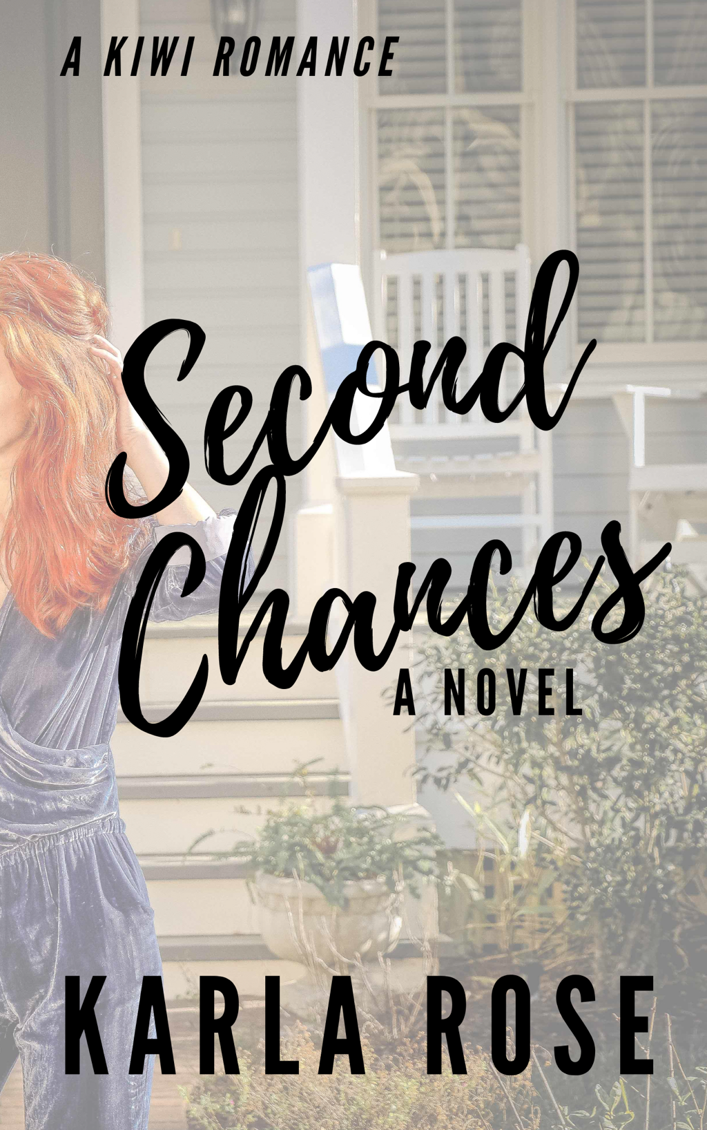
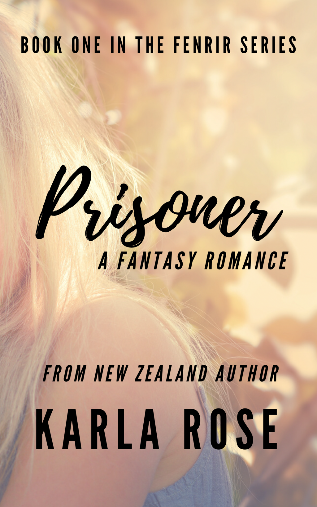
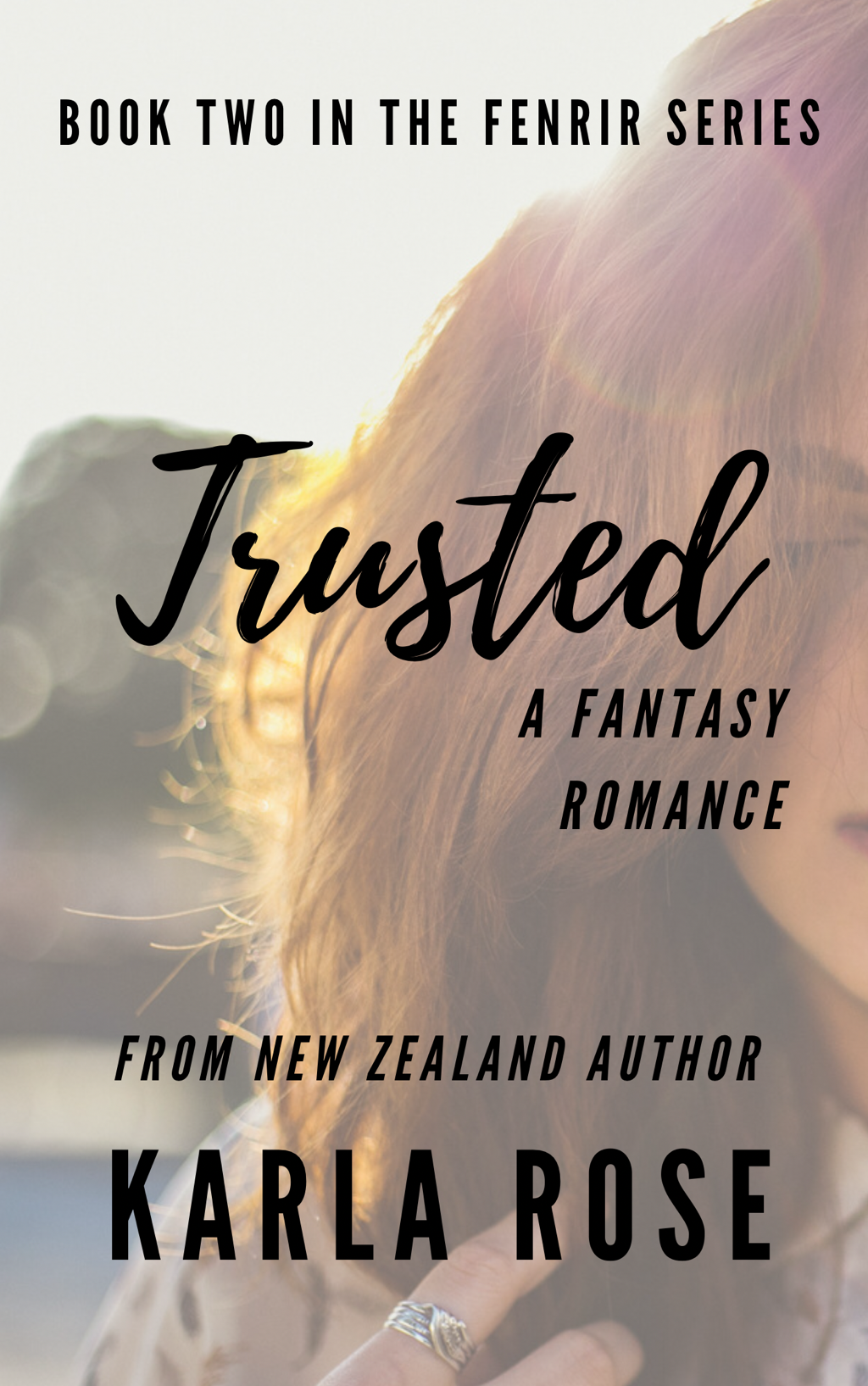
One of the things you don’t generally imagine, or at least I didn’t imagine, when you sit down to write your first novel is that you’ll not only need a cover, but that you’ll have enlist someone to create one, or do it yourself.  When you complete your manuscript and decide you’ll publish, it becomes quickly apparent that you are going to need something for the cover. I mean what’s a book without a cover? Whether you are exclusively producing a physical book, or have decided to also produce digital and audio books, people look at the cover. I mean they really look. There are lists for best and worst indie covers, and if your cover is terrible people will make comment (or simply won’t buy your incredible work of literature), because like it or not people buy with their eyes. When it comes to producing cover art there are a few different ways to go about it. 1.) You can pay for a professional to create a cover specifically for your book. This is an incredible, though often pricey, option that ensures quality and if you are writing a series will guarantee continuity between books. Good professional cover artists know what they are doing, their abilities are undeniable, and because they have trained in the industry not only do the know what will suit the genre you are writing in, but they will make sure that any images used don’t breach copyright. 2.) You can purchase ready-made covers. This service means you go through a professional cover artist, but the cover you purchase has not been custom made for you or your story. These are less costly, but aren’t guaranteed to be exactly what you want, and they are usually non-exclusive which means another author could purchase and use the same cover as the one you have purchased. 3.) You can make your cover yourself. The beauty and flaw in this option is that the quality of what you get will depend entirely on the skills and knowledge you possess when it comes to graphic design, and how much money you a willing to invest in training and tools to produce your cover. So, if you haven’t figured it out after last week, I am cheap. Like super cheap. I have difficulty justifying spending money on my books which means that unsurprisingly I chose option three. I won’t lie, if I had the money I would be all over option one. There are some incredible graphic artists out there and building relationship with one while compensating them appropriately for the work that they’ve put in can be an major benefit for an author. It means you have a consistent source to go to for any and all of your graphic art needs, and you’ll likely have many, someone who already knows what you like and if you really invest in the relationship, someone who will cheer you own, especially as a win for you is also a win for them. One of my long term goals will be to have a professional create cover art for my books, but until that’s possible I will be making my own covers. There are lots of programs you can use, Adobe in particular is fantastic, but it is also pricey, which is why I use the free version of Canva. Canva is a very basic drag and drop graphic design program. It provides both free and low cost elements for you to utilise in your cover production and even templates to use as a guide.
There are lots of ways to create something truly tragic. SO MANY WAYS. I’ve probably done them all, but overall I am happy with the cover art I’ve created and if nothing else they are attractive place fillers until I can employ a professional to create something that is so awesome that people can’t walk past my book without picking it up. So I want to offer you a few tips that have helped me.
1.) Limit your fonts. Seriously, try not to use more than three. If at all possible use the same three fonts for all of your marketing. The only thing that would encourage me to use anything different is is you have a genre change and even then I would try to ensure every book I write in that genre utilises the same three fonts. Eventually when you do this readers start associating you and the specific feel of your writing to your selected font which can increase the likelihood of them picking up your book. When you choose your fonts do some research into books of a similar genre to yours, the last thing you want to do is choose a font that is typically associated with horror if you write in the romance genre. 2.) Pick your colours - like with your fonts it’s important you consider how you want to present yourself. Limit your colours to three primary colours and make sure they are a good representation of the genre you are working in. Do some market research, see what you like and what authors of a similar genre are using then find your own version and use it for your covers. 3.) Be aware of your borders - by this I mean make sure that your writing isn’t too close to the edges or you run the risk of losing portions of your writing if/when you print a physical copy of your book, and we all know that losing a letter not only looks unprofessional but can often completely change the meaning of a word. 4.) Check your image quality - Sometimes this might require you to print a physical proof, but if you see any pixelation in your digital copy you can guarantee that the printed version will be a lot worse, so unless you’re actually going for pixelated imaging check and double check your image quality. 5.) Make sure people can read your title - I find it very frustrating when I pick up a book and can’t actually read the title because it fades into the background. People want to know what your book is called, they want to be able to tell their friends about it, and it awful hard to do that if they can’t read the title. This may mean you’ll need to adjust the transparency of your image. 6.) Get opinions - some people probably won’t like this, but asking a range of people, preferably those who read in your genre and won’t blow smoke up your... I mean, won’t just tell you what you want to hear, is a good way to see if what you’ve developed is good, more so if they’ve read your books and know your characters, those people already have an insight on your book world and will quickly be able to pick up if it feels right or not. 8.) Watch tutorials - there are so many YouTube tutorials that can help you learn how to use the tools you have access to, so use them. Sometimes the difference between truly awful and okay (cause let’s be honest, you’re still not a professional graphic designer) is knowing what you have access to and how to use it. When you DIY you run the risk of making mistakes, there is always the possibility of criticism, and its more than likely that it won’t look as professional as you’d like. It may not be perfect, but that’s okay, do the best with what you have and then make a plan so you can save up and work towards investing into the service that you would ultimately prefer. In my opinion this whole author thing is a journey, some people may start with advantages you’re yet to access, you may have to work to get to there starting point, but it’s worth it. Someone, somewhere, at some point of time will find your book and it will be there go to in stress, it will be their compulsory annual (or multi-annual) read. Your story is worth releasing into the world, even if the cover is more basic than you’d hope. Praying that you find confidence and the knowledge that perfection isn’t required for your work to be good. God Bless Karla
0 Comments
Your comment will be posted after it is approved.
Leave a Reply. |
Karla RoseI'm a Christian, a wife, and a mother of two living in the wonderful Waikato 
Archives
April 2021
|